Inspect
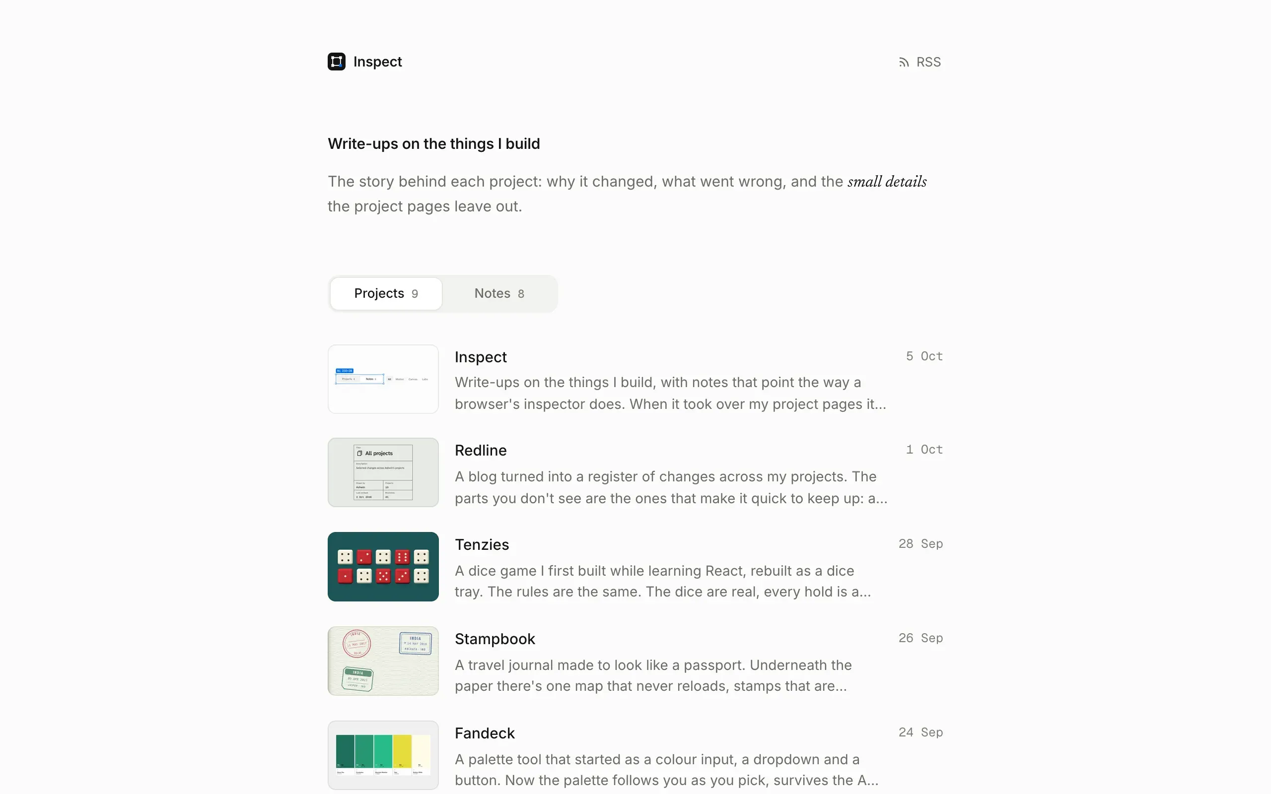
Write-ups on the things I build, with notes that point the way a browser's inspector does. When it took over my project pages it split into write-ups and notes, and most of the work since has gone into moving between them without a flash.
- Made
- 2026
- Stack
- Astro 7, MDX, TypeScript, View Transitions
Inspect is where I write up the things I build. It’s static, built with Astro and MDX, one quiet column with one blue for everything that points. The pointing, the boxes that follow a clip and the scroll that comes back with you are how it started.
Until this month the story of each project lived somewhere else: ashlog, a notes site forked from someone else’s project, laid out like a spec sheet. Those pages moved here and became project write-ups, and the posts that were already here became notes. That turned one list into two, and two lists meant a switch.
Two kinds of post
Write-ups and notes are one content collection over two folders. A post’s id is its folder path, so which kind it is comes from the id, and the URL is the id too:
const posts = defineCollection({
  loader: glob({ pattern: '{notes,projects}/*/index.{md,mdx}', base: './src/content', generateId }),
A note’s first tag is its project’s folder name, and that’s how a write-up finds its “Notes on” list. Going the other way, a note’s project name finds the write-up, so the Project fact on a note links to it. The old /posts/* URLs answer with a 301 to /notes/*.
A switch that stays on the page
The first switch was two pages and a link. A cross-document view transition held the intro and the switch still while the list crossfaded, so it looked like one page. It wasn’t. Every switch was a page load, so the scroll went back to the top, and switching from halfway down the list threw you to the top of the other one.
Now both pages render both lists, stacked in one grid cell, and the one you’re not looking at is inert and hidden:
.panels { display: grid; }

.panel {
  grid-area: 1 / 1;
  min-width: 0;
}

.panel[inert]:not(.leaving) {
  visibility: hidden;
}
The cell is as tall as the taller list, so swapping them can’t change the height of the page. A click on Projects or Notes, or on a filter, is caught on the page, and history.pushState changes the URL and the title, so back and forward still work.
The swap moves the way the switch does. The rows you’re leaving slide 16 px toward the tab you came from and fade in 110 ms. The new rows come in from 24 px the other side, 28 ms apart, on a spring that overshoots by 2%, and the pill under the labels rides the same spring. Only rows on screen move; the rest just appear. A filter does the same thing vertically: the old rows lift away, the new ones rise in.
The filters sit on the same row as the switch on both tabs. On Projects they’re invisible but still take their space, so the list starts at the same height on both and nothing under your cursor moves.
Crossfades that add up to one
Moving between pages had a flash in it: halfway through, the page went pale for a moment. The old page faded out in 180 ms on an ease-in while the new one took 300 to 380 ms on an ease-out. A view transition blends the two with plus-lighter, which adds their opacities, and that only looks solid when the two add up to one. With different lengths and curves, they didn’t, and the background showed through.
Now both use the same curve and the same length, so whatever one loses the other gains:
::view-transition-old(root) {
  animation: vt-out 280ms var(--out) both;
}

::view-transition-new(root) {
  animation: vt-in 280ms var(--out) both;
}
Two smaller fixes went with it. The entrance animation had a blur in it, and showing rows again after a filter replayed it, so the text smeared on the way in. The blur is gone. And an image that hasn’t arrived 100 ms into a page fades in when it does, while one that’s already cached shows at once.
Phones drawn in CSS
Write-ups show a project on an iPhone, an iPad and a desktop. The devices aren’t pictures. The frame, the side buttons, the Dynamic Island and the status bar are drawn in CSS around the screenshot, all in the device’s own points, times one unit --k worked out from the room the figure has. The same frame works at any width.
The status bar has to be readable on the app behind it, so its ink comes from the screen colour:
const n = Number.parseInt(m[1], 16);
const ch = [n >> 16, (n >> 8) & 255, n & 255].map((v) => {
  const c = v / 255;
  return c <= 0.03928 ? c / 12.92 : ((c + 0.055) / 1.055) ** 2.4;
});
return 0.2126 * ch[0] + 0.7152 * ch[1] + 0.0722 * ch[2] > 0.4;
That’s the relative luminance from the contrast rules. On Chit’s sage desk it comes out light, so the clock is dark; on Tenzies’ felt it’s dark, so the clock is white.
Filming at a tenth of the speed
Clips here are recorded from local builds with Playwright, and they have to be sharp on a retina screen. Chrome’s screencast only hands back frames at 1x, so each frame is a full screenshot at 2x instead, and those come slowly.
So the page is slowed down. A script swaps performance.now, Date.now, the animation frame clock and timer delays for versions that run at a tenth of the speed, and CSS and Web Animations are slowed to match over the DevTools protocol. Each screenshot keeps the time it was taken, and the clip is put back together from those times at full speed. The clip above was 3.6 seconds of clicking that took 36 seconds to film, about 200 frames for every second of the page.
Rough edges
- No search. There are few enough posts to scan, for now.
- Both lists on both pages. The switch costs a few kilobytes of HTML and eight more small thumbnails on each list page.
- The glide needs a recent browser. Without cross-document view transitions, pages change without the title glide. Everything else still works.
- Slow to film. A ten second clip takes minutes to capture and review, so most write-ups get one or none.