Portfolio
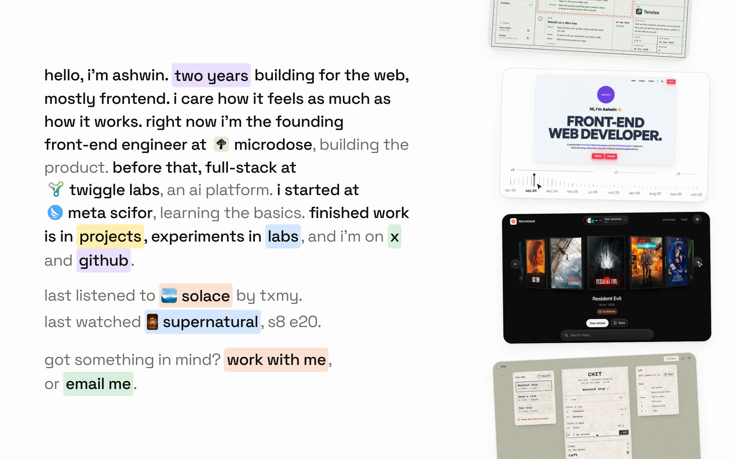
The third version of my portfolio: one paragraph about me and a reel of things I built. No animation library, so the reel, the grid and the loading are all small bits of maths I can point at.
- Made
- 2026
- Stack
- React 19, React Router 8, Vite 8, TypeScript 7, Tailwind CSS 4
 Portfolio is the third version of my portfolio, at ashwin.co.in. It took that address over from v2 on 7 October 2026, and v2 stays up at v2.ashwin.co.in. The home page is one paragraph about me, ending with what I last listened to and watched, and a reel of things I built, each card playing a recording of the real app. Projects and labs have their own pages, every project gets an essay with figures, and the résumé hangs off the words “two years”. A sentence saying “more in my résumé” cost the paragraph an extra line at 1440 and 769 px wide; a link on words that were already there costs none.
I started it on 25 August 2026, in React, TypeScript and Vite, and kept one rule from the start: no animation library. Every moving thing is a short function I can read, which is what this write-up is about.
A reel on a curve
The cards ride down the right side of the page on a parabola. Each card’s position along the run, from 0 at the top to 1 at the bottom, gives its pose:
const t = clamp01(p);
const b = bulge(t);

const slope = span > 0 ? (amp * bulgeSlope(t)) / span : 0;
const rot = tilt * Math.atan(slope) * (180 / Math.PI);

return {
  perp: amp * b,
  rot: Math.max(-maxRot, Math.min(maxRot, rot)),
  scale: 1 + lift * b,
};
bulge is 1 - 4(p - 0.5)², so a card sits furthest out at the middle of the screen. It banks to follow the curve’s slope, at 45% of the true angle and never more than 9°, and grows by 6% at the top of the bulge. How far the curve bows out isn’t fixed either: a 16 step binary search finds the largest bow whose rotated, scaled cards still fit the room beside the paragraph, so a narrow window gets a flatter curve rather than cards off the edge.
The speed is set by the screen, not in pixels: a card takes 18 seconds to cross, however tall the window is. Cards that leave the run pause their video until they come back.
Slowing down when you look
Rest the pointer on the reel and it slows to a stop, so you can read a card. The loop keeps one velocity and nudges it toward a target every frame:
const dt = Math.min(dtMs, MAX_FRAME_MS);
const k = 1 - Math.exp(-dt / tau);
velocity += (target() - velocity) * k;
The target is zero while held and the crossing speed otherwise, and tau is 260 ms. Because the step uses the real frame time, it eases the same on a 60 Hz and a 120 Hz screen, and the 50 ms cap stops a background tab from jumping the reel when it comes back.
Two strips on a phone
A phone has no room beside the paragraph, so below 768 px wide, or under 560 px tall, the curve becomes two straight strips, one above the paragraph and one below, running at 30 px a second in opposite directions. Each strip holds its cards twice and moves by one period, so the loop never shows a seam.
The last song and the last show
The paragraph ends with the last thing I played on Spotify and the last thing I watched on Simkl. The site is a static Vite build, so two small Vercel functions fetch them. One trades a Spotify refresh token for the current or last played track. The other passes through simkl-api, a small server of mine that finds the newest thing in my Simkl history. The browser never calls either service, and the line isn’t in the prerendered HTML: it opens once the data and thumbnail preloads settle, easing the extra lines into the paragraph.
Neither service sends a title that fits in a sentence. Spotify sends “Kesariya (From “Brahmastra”)“, “worry - Slowed”, or a title with four artists credited inside the brackets. Before a title goes in a chip, it’s split into the song, a version, the film it’s from and any featured artists:
for (const group of groups) {
  const feat = /(?:^|,\s*|\s)(?:feat\.?|ft\.?|featuring|with)\s+(.+)$/i.exec(group);
  if (feat) featured.push(...feat[1].split(/\s*(?:,|&| and )\s*/));
  const credits = credited.some((a) => group.toLowerCase().includes(a.toLowerCase()));
  if (feat || credits) continue;
  if (VERSION.test(group)) version = group;
  else context = group.replace(/^from\s+/i, "").replace(/^["'“]|["'”]$/g, "");
}
The sentence names one artist or two, and past that “pritam and 2 others”, put together with Intl.ListFormat. A chip is about 15 characters wide; a longer title fades out at the edge, and on hover it slides by exactly the part that’s hidden.
I tried a larger pair of floating cards, then settled on a compact cover beside a column of text. The cover keeps its full shape, and a peach or blue rule connects the details to the highlighted title. The preview opens right under its own line, and the lines below move down to make room. I tried a card floating over the text again in October and went back to this one; it has more personality.
The paragraph sits in the middle of its column, so anything that grows inside it pushes the text above it up as well. Opening a preview used to lift the whole introduction by half the preview’s height. Now the closing line takes a negative bottom margin as tall as the preview, so the paragraph’s height doesn’t change and nothing above the preview moves. On a short window that would push the closing line off the bottom, so the margin only takes the room that’s there:
const room = (host.parentElement?.clientHeight ?? 0) - (host.offsetHeight - reveals - margin);
host.style.setProperty("--now-h", `${active ? tallest : 0}px`);
host.style.setProperty("--now-m", `${active ? Math.max(0, Math.min(tallest, room - tallest)) : 0}px`);
Both previews open to the taller card’s height, so going from the song to the show leaves the closing line where it is.
The first version could open twice when I approached a highlight from below. Expanding the paragraph moved the trigger away from the pointer, which closed it, then put it back under the pointer. Now only a physical pointer crossing starts a preview. While it is open, the hit area joins the highlight’s original position, its current position and the visible card. That keeps the card reachable while the layout moves.
There is a 90 ms pause before opening, 50 ms when the other preview is already open, and a 200 ms grace period before closing, with 14 px of slack around the highlight and the card so drifting off an edge doesn’t close it. Moving straight to the other highlight swaps the cards: the old one blurs out while the new one fades in over it, with no movement, the same in both directions. Slowed to a tenth, the first version of that swap had a frame with nothing in it, because the old card was gone before the new one started. Hovering the plain sentence never starts it.
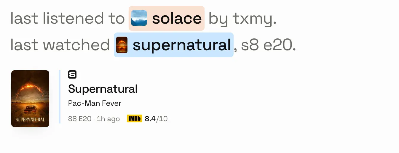
The sentence already says “last listened” or “last watched”, so the preview does not repeat it. A playing track gets “now playing”; a past one gets its relative time when Spotify supplies it. The show keeps its episode title, watched time and rating, and shows an episode total only for entries numbered without seasons. Clicking the preview opens the same resource as its highlight. Keyboard focus on a highlight opens its preview and Escape closes it; the highlight carries the full label, so the card stays out of the tab order.
Simkl’s history only keeps an anime’s original title, so Bleach arrives as “Bleach: Sennen Kessen Hen - Kashin Tan”. simkl-api looks up the English one, takes off the “season 17” Simkl adds to it, and splits what’s left into show, subtitle and arc. Simkl lists a split season as its own entry, which is where “The Calamity” comes from. One Piece uses one continuing entry, so its episode title carries the story instead of an arc label.
If nothing has played for a week, the music half goes. If one service is down, its half goes, and if both are, the line isn’t there at all and the paragraph reads as it did before.
Columns that know their heights
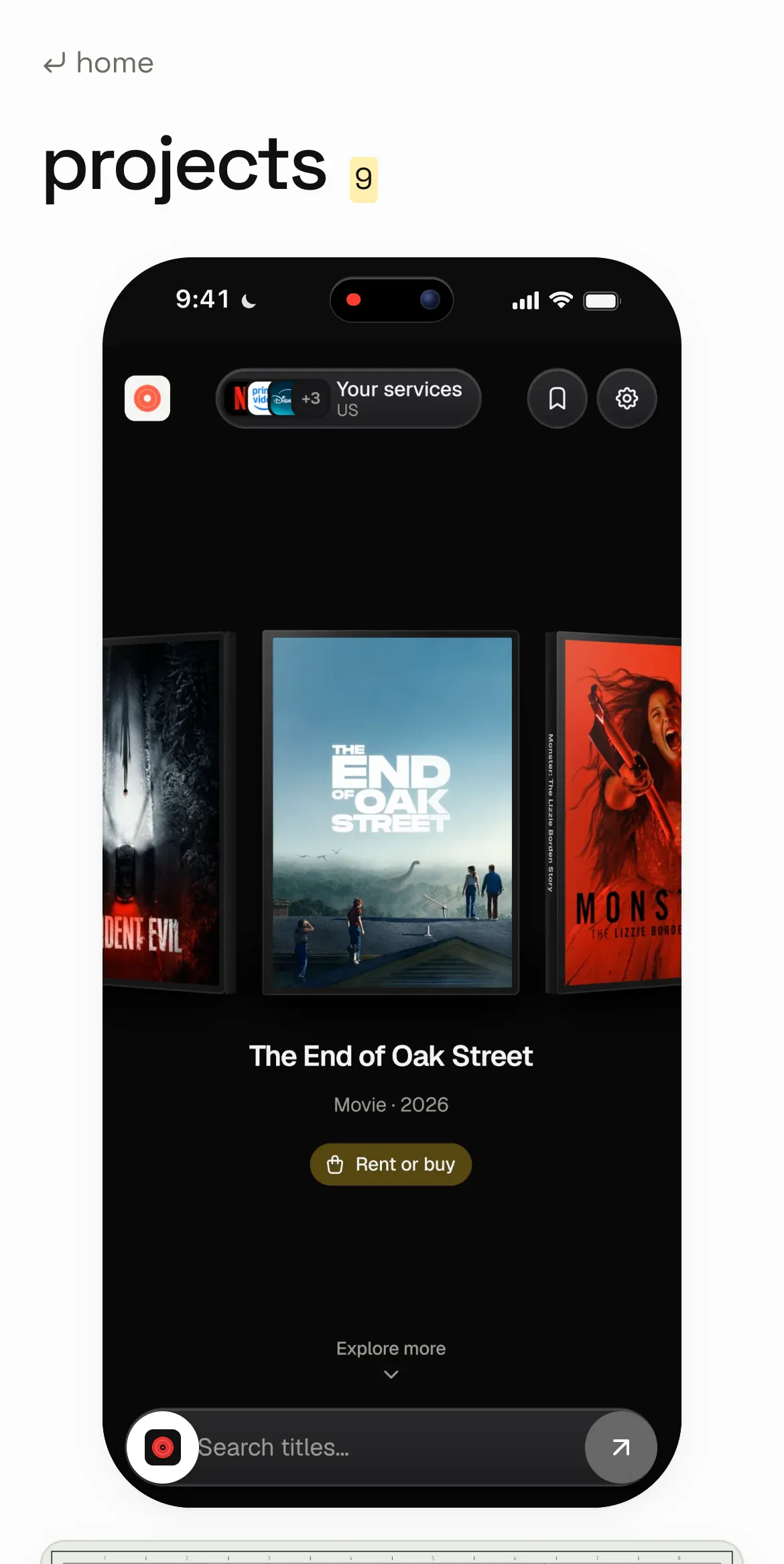
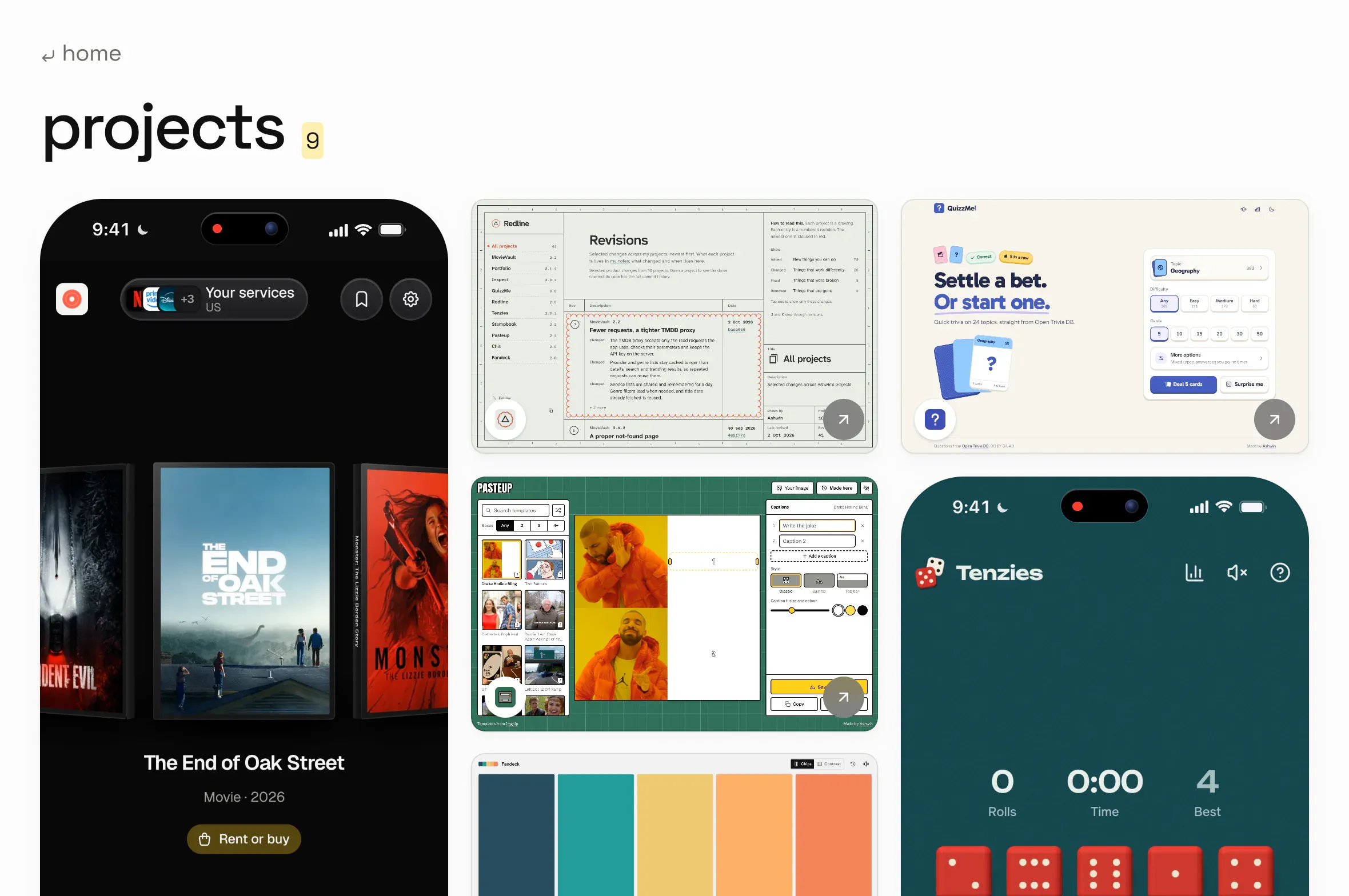
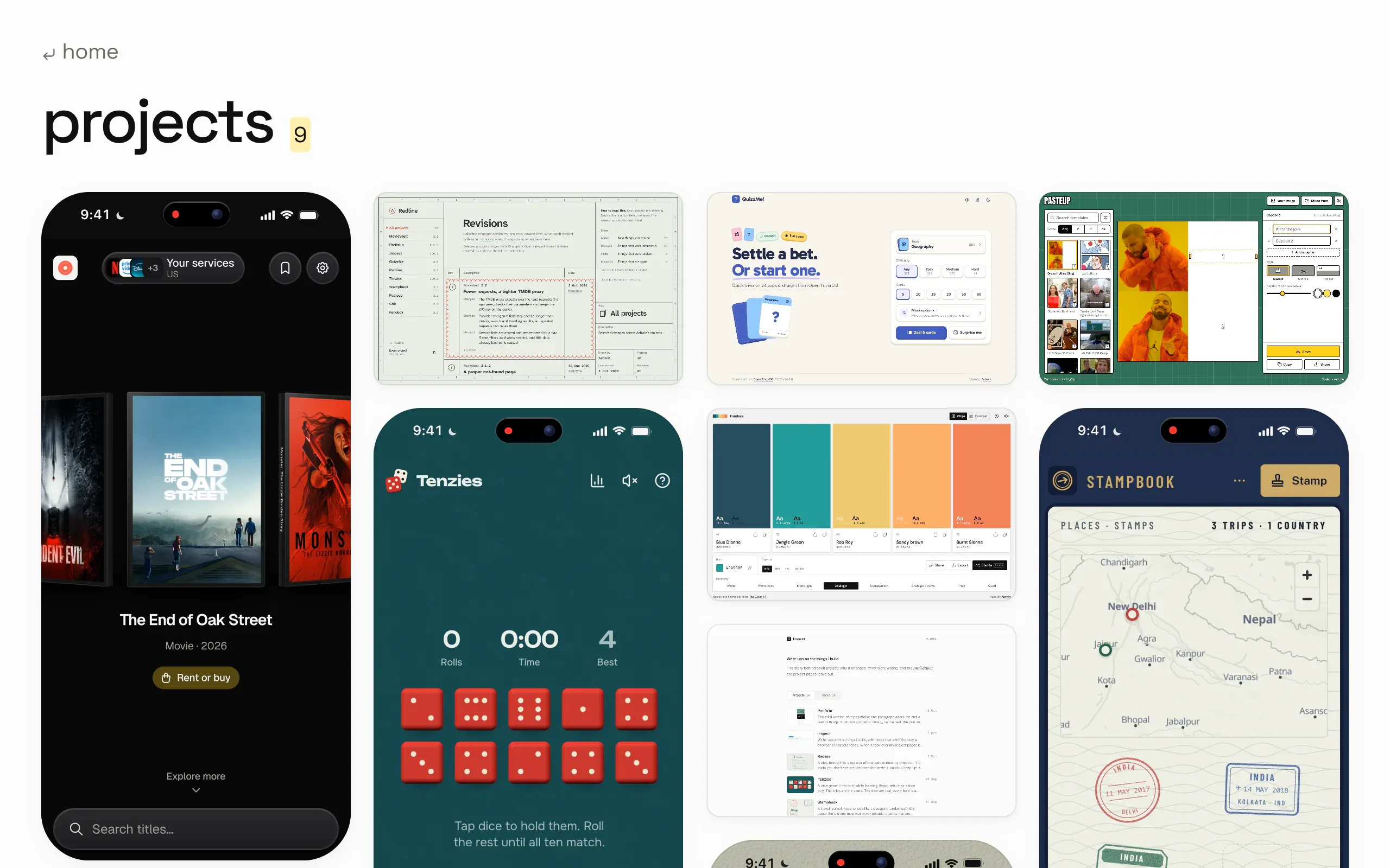
The projects and labs pages are a masonry of clips and covers. The columns are worked out before any image loads, from aspect ratios kept in the data:
aspects.forEach((aspect, index) => {
  const height = (aspect > 0 ? 1 / aspect : 1) + gutter;

  let shortest = 0;
  for (let c = 1; c < count; c++) {
    if (heights[c]! < heights[shortest]! - 1e-9) shortest = c;
  }

  out[shortest]!.push(index);
  heights[shortest]! += height;
});
Each card goes to the shortest column, counting the gap under it as 7.5% of a column’s width, and ties fill from the left. A phone recording is 1:2, so it takes a column’s worth of height on its own. The number of columns comes from the width: four from 1240 px, three from 900, two from 500, and one below that, because two columns on a small phone leave a clip too small to read.
A page before the app
The site is rendered in the browser, so for a moment after a page arrives there’s nothing to draw. Instead of a spinner, every route’s HTML ships with its own page already inside it. At build time a Vite plugin renders each route from the real components, at several widths, strips the media out and turns the text into shimmer bars. Widths that came out the same are merged, and each version that’s left is wrapped so it only shows inside its own width range. When the app starts, it replaces the skeleton with the real page, and since the skeleton came from the same components, nothing moves at any width.
A small inline script drops the skeleton when the URL isn’t the one it was built for, so a mistyped link doesn’t flash the wrong page’s shape on its way to the 404.
Pictures that wait 380 ms
Media that arrives within 380 ms, or comes from the cache, or lands off screen, just appears; anything that shows a placeholder for a split second looks like a flicker. Slower media shows a blurred preview of itself, made at build time and stored with the image’s real size, and then sharpens in. A phone recording blurs as one picture with its frame, status bar and island, and a failed image keeps its blurred colours with a small image-off mark instead of the browser’s broken icon.
That last part had a bug during the rebuild. While a phone clip loads, its screen is allowed to spill past its rounded corners so the blur can bleed out softly. That was switched back off only when a clip ended up “ready”, and a clip that landed late, while you were watching, ended up “slow” instead. So on a slow connection the screen never got its corners back, and the red of a film poster showed as a thin line down the edge of the phone. The spill now only applies while loading or after an error.
Rough edges
- The recordings stay light. The site follows your system into dark mode, but the clips were recorded in light mode, so they glow on a dark page.
- Client rendered. The skeletons, titles and metadata are written at build time, but the page itself needs JavaScript.
- One reel, one speed. Holding the reel is the only control; there’s no way to scrub it.
- A minute behind. The Spotify function caches for 30 seconds and the page asks again every minute, so the line can trail a song change.
- No card on a phone. On a touch screen the chips are plain links to Spotify and Simkl; the preview is reserved for a fine pointer or keyboard focus on desktop.