Drawing the revision cloud
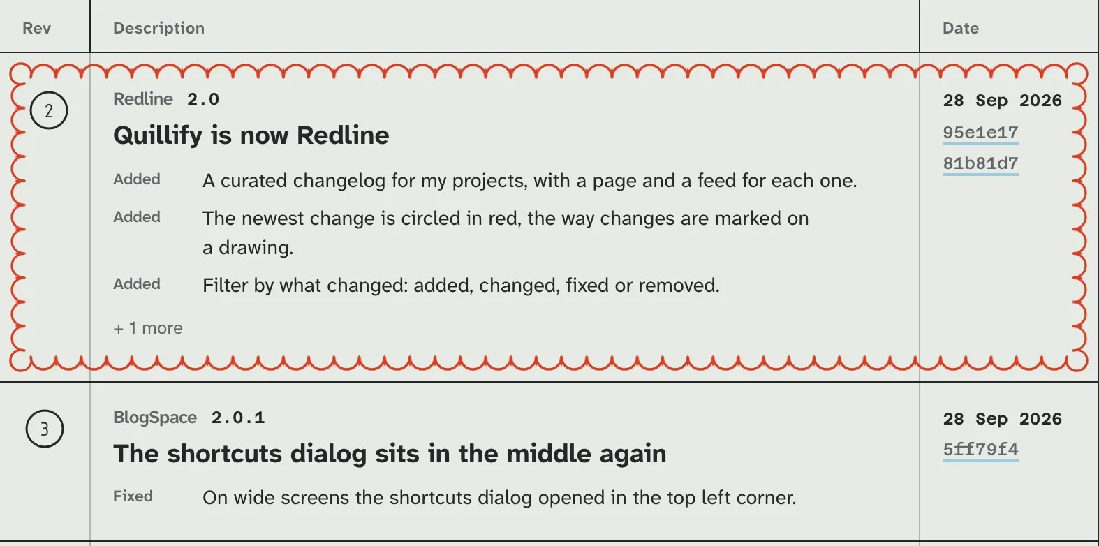
Redline circles its newest change in a red scalloped cloud, the way changes are marked on an engineering drawing. The whole cloud is one 36 pixel SVG and a border. Here is how it tiles, how it used to draw itself in, and why it now just fades.
- Project
- Redline
- Stack
- Next.js 16, React 19, Tailwind CSS 4, Neon
 Redline is the changelog for my projects, laid out as an engineering drawing: a sheet with zone numbers round the edge, a title block in the corner, and a revision table where each project’s releases are listed. On a real drawing, whoever revises it marks the change in red pencil and draws a scalloped cloud around it so the next reader cannot miss it. Redline does the same for its newest release, and nothing else on the page is red.
A cloud is a border
The first instinct is to draw the cloud: measure the row, work out how many bumps fit along each side, and generate a path. That breaks the moment the row changes height, which in a changelog is every row.
border-image already solves this. It takes one image, cuts it into a three by three grid, puts the corners in the corners, and repeats the edges along the sides. So the cloud is a 36 pixel SVG of eight arcs, big ones at the corners and small ones between:
<svg xmlns="http://www.w3.org/2000/svg" width="36" height="36" viewBox="0 0 36 36"
  fill="none" stroke="#d63e27" stroke-width="1.1" stroke-linecap="round">
  <path d="M9 12A5 5 0 1 1 12 9M12 9A6 6 0 0 1 24 9M24 9A5 5 0 1 1 27 12M27 12A6 6 0 0 1 27 24M27 24A5 5 0 1 1 24 27M24 27A6 6 0 0 1 12 27M12 27A5 5 0 1 1 9 24M9 24A6 6 0 0 1 9 12"/>
</svg>
and the CSS is one declaration on a pseudo-element that sits over the row:
.cloud::before {
  content: "";
  position: absolute;
  inset: 4px;
  border: 18px solid transparent;
  border-image: url("/cloud.svg") 12 / 18px / 0 round;
}
12 slices the image into 12 pixel cells, so each cell holds exactly one scallop. 18px draws those cells at 18 pixels, a little heavier than the source, like a pencil pressed harder. round is the part that makes it look drawn rather than stamped: instead of repeating the edge cell and chopping off whatever is left, the browser stretches or squeezes the cells slightly so a whole number of scallops fits each side. No half bumps at the corners, on any row.
Drawing it in
The first version did not just show the cloud, it drew it: a pencil going round the row, starting on the top edge and running clockwise. There is no stroke to animate on a border image, so the trick was a mask. A conic gradient, solid up to an angle and clear after it, hides everything the pencil has not reached yet:
@property --sweep {
  syntax: "<angle>";
  inherits: false;
  initial-value: 360deg;
}

.cloud::before {
  mask: conic-gradient(from 300deg, #000 var(--sweep), transparent 0);
  animation: sweep 760ms cubic-bezier(0.45, 0.05, 0.3, 1) 180ms both;
}

@keyframes sweep {
  from { --sweep: 0deg; }
  to { --sweep: 360deg; }
}
Registering --sweep as an <angle> with @property is what makes it animatable. An unregistered custom property is just text, so the browser would flip it from 0deg to 360deg in one step. Registered, it knows the in-betweens, and the gradient’s hard edge rotates round the row. Starting at 300deg swings the start sixty degrees back from twelve o’clock, so on a wide row the pencil sets off from the top edge, left of centre, rather than from the middle.
Try it here with the real cloud.svg and both versions of the CSS. Drag the angle to see what the mask is doing, and turn the mask on to see its wedge.
Redline 2.0
Quillify is now Redline
AddedA curated changelog for my projects.
28 Sep 2026
I checked the draw frame by frame when it shipped: it runs clockwise and is done about 940 ms after the page shows, 180 ms of delay and 760 ms of drawing.
Why it fades now
In the refinement pass on 29 September, the draw became a 220 ms fade. The same pass made project pages load from cached reads and move between each other with view transitions, so a page now arrives almost as you click, and the cloud shows up on every project you open. A fade finishes in a quarter of the time and asks for no attention on the way. The cloud still does its job either way: it is the only red on the page.
Small things that keep it honest
- The cloud is a pseudo-element over the row, not a border on it, so the row’s own box, padding and hover do not change when it is the newest.
- It has
pointer-events: none, so it never steals a click from the release link underneath. - The 404 page wears the same cloud around its message, so a missing page looks like a change someone marked.
 border-image