A picker that is always full
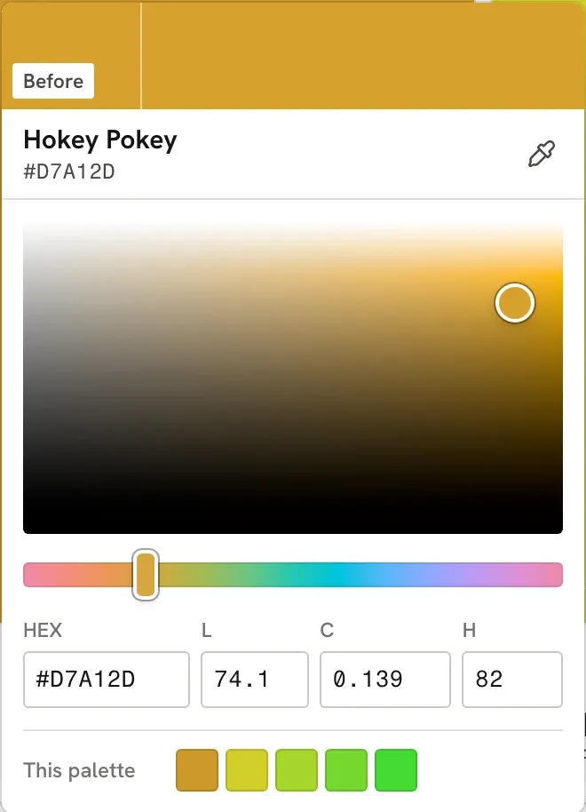
Fandeck swapped the browser's colour input for its own OKLCH picker. The honest way to draw OKLCH is a lopsided shape with a hole in it, and I did not want that. So every row of the square is stretched to its own edge.
- Project
- Fandeck
- Stack
- HTML, CSS, JavaScript, The Color API
 Fandeck makes a five colour palette from one colour you pick, and lays it out like paint chips: a field of colour on top, a white label underneath. For a tool about colour, the way you pick the first colour matters more than anything else on the page, and for most of its life Fandeck used
 <input type="color">, which hands you whatever picker the browser or operating system has, looking nothing like the page around it.
The first build was not Fandeck
Before the picker there was a false start worth owning. The first rebuild copied the look of QuizzMe, the project I had just finished: a violet accent, a gradient on the shuffle button, a frosted glass dock, a glow behind the header tinted by your colour, and a dark mode because everything has one. It looked finished and it looked like everything else.
It got rejected, rightly, and the rule that came out of it now covers every project I rebuild: each app gets its own design direction from what it is. A colour tool should have no colour of its own, because colour is judged against neutral grey. So Fandeck’s interface is white, grey and ink, the active state is solid black, and the only colour on the page is yours. Dark mode went too, and so did the “Surround” switch that briefly replaced it, because neither did anything for the colours.
With the chrome out of the way, the plain little system picker stood out even more. It had to go.
Why OKLCH
HSL is the usual choice for a picker square, and it lies about lightness. An HSL yellow and an HSL blue at 50% lightness look nothing alike: the yellow glows and the blue is nearly navy. OKLCH is built so equal steps look like equal steps. L is how light a colour looks, C is how colourful, H is the hue. Fandeck already showed OKLCH values on its chips, so the picker speaking the same language made sense.
The catch is that OKLCH describes more colours than a screen can show. At every lightness and hue there is a maximum chroma past which the colour is out of the sRGB gamut, and that maximum is different for every hue and every lightness. Yellow can be very colourful when it is light. Blue can be very colourful when it is dark.
The honest square, and why it went
The honest way to draw it is lightness down the side, absolute chroma across, and paint only the colours that exist. That is plane A below. Move the hue and watch it.
AThe gamut slice, chroma 0 to 0.37
BFandeck's square, each row to its own edge
For yellows it is a sliver down the right, for blues a fat wedge near the bottom, for most hues a lumpy triangle with a lot of hatched nothing. It is accurate, and it is a bad control. Half the square does nothing when you click it, the shape jumps around as you drag the hue, and the colour you want is always crammed into a corner. I tried it and dropped it.
Plane B is what shipped. Lightness still runs down the side, but across each row chroma goes from grey to that row’s own maximum. The right edge of the square is always the most colourful colour that lightness allows, so the square is always full, every point on it is a real colour, and the corners always mean the same thing: white, black, the purest colour, grey.
function planeAt(e) {
  const r = plane.getBoundingClientRect();
  const l = 1 - clamp((e.clientY - r.top) / r.height, 0, 1);
  const x = clamp((e.clientX - r.left) / r.width, 0, 1);
  return { l, c: x * maxChroma(l, lch.h), h: lch.h };
}
The cost is that “across” no longer means the same chroma on every row. Half way across a light row and half way across a dark row are different amounts of colour. For picking a base colour that trade is fine, and the C field under the square always shows the real number.
The rest of the picker
- Dragging the hue keeps you in gamut. Chroma is clamped to the new hue’s edge as you go, so a vivid yellow dragged towards blue does not turn into an impossible colour.
- Keys work. The square takes arrow keys for lightness and chroma (Shift for bigger steps), the hue strip takes left and right.
- It fits where you are. It opens as a popover above the control bar, gets compact on short portrait screens and goes two columns on a landscape phone.
- This palette and recent. Quick picks for the colours you already have, because the next base is usually one of them.
What I would tell myself
The accurate diagram and the useful control are different things. Plane A is the one you draw in an article about colour spaces. Plane B is the one you give someone who wants a nice green. It took building both, side by side, to stop thinking of the second one as cheating.
 OKLCH picker
 OKLCH in CSS
 A perceptual color space